Using CSS with Gin
- 10 minutes read - 2011 wordsThis is the seventh in a series of articles about writing a small reading list app in Go for personal use.
So far we’ve built a sort-of usable app with Gin. We can see the list of books we have in the system, and we can add new books. But there are some serious usability problems:
- there’s no link to the “New Book” page, or to the “Book List” page – you have to know the URLs and type them in directly
- both the input form and the list suffer from poor layout, almost to the point of being unreadable
In this article we will fix those issues and set up a foundation so that future work will have established patterns for styling.
When we’re done you’ll have:
- external CSS and a way to reference it from the pages in the app
- a navbar to be able to easily click around the app
- some options for managing that external CSS with the app’s deployment
Fair warning: I’m not a CSS expert, so don’t assume that anything I’m doing with the actual CSS is “the right way”. I’m more interested in demonstrating the mechanisms and patterns that we can use for integrating these pieces. When I need stuff to actually look nice and be maintainable and scalable I talk to real designers.
Navigation Menu
First, let’s add a navbar. In templates/base/header.html, just below the body, add a header element containing a list of the links to the pages in the app.
  <header>
    <nav>
      <ul>
          <li><a href="/"><strong>Aklatan</strong></a></li>
          <li><a href="/books/">Books</a></li>
          <li><a href="/books/new">New Book</a></li>
      </ul>
    </nav>
  </header>
Rebuild the app, run it, and load the main page in your browser to see:
Screenshot of adding the navigation menu before adding styling.
Since we added this to the header template, we will get this in all the pages of the app. Click on the New Book link and you will see the form, and the navbar will be present on that page too.
Now we have our navbar and we’ve fixed the usability problem noted above, we’ve also arguably made the app look a little bit worse because of the clutter of the links at the top. Let’s dive into the CSS so we can make this not look like trash.
To add styles we have two options: put them in a style tag in the header, or put them in a separate file that is linked from the header. We’ll do the latter, because duplicating the styles over and over in every page that we send is a waste of bandwidth. This duplication would make pages load more slowly for our users and depending on our hosting plan it could cost us more money.
Add this code to static/css/styles.css:
body {
    padding-top: 2rem;
}
header {
    background-color: #a15088;
    position: fixed;
    left: 0;
    right: 0;
    top: 0;
    height: 2rem;
    display: flex;
}
nav {
    margin: 0.5rem;
}
header * {
    display: inline;
}
header li {
    margin: 1rem;
}
header li a {
    color: #d4d06a;
    text-decoration: none;
}
I won’t go into the details of the CSS since that’s not the focus of this series; this article’s focus is just on CSS integration with the app.
In order for these styles to actually have any effect on the pages, we need to link them from the html. Again in header.html, add this line in the head section:
<link rel="stylesheet" href="/static/css/styles.css">
We also need to tell the app to serve the CSS file. Do that by adding this line to setupRouter:
r.Static("/static", "./static/")
Rebuild, and reload your browser, and you will see a lovely gold-on-pink navbar to the top of the page:

Screenshot of adding the navigation menu after adding styling.
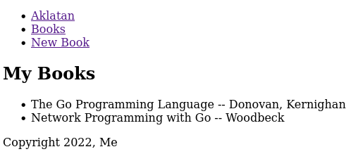
List / List Items Fixup
Now that we’ve got navigation handled, the list of books doesn’t seem all that bad. But I think there are two things we can do that will make it a little bit easier to read:
- The main thing we care about is the title. We can emphasize this, and de-emphasize the author name.
- We can add a bit of extra space between the items and remove the bullets. This will allow the reader’s eye to more easily scan down the list without one line blending into the next.
In order to be able to apply the necessary styles to the specific elements we want, we have to make some minor structural changes. Change templates/books/index.html so that it looks like:
{{ define "books/index.html" }}
{{ template "base/header.html" . }}

<h2>My Books</h2>

<ul class="books">
  {{ range .books }}
  <li class="book">
    <span class="title">{{ .Title }}</span>
    <span class="author">{{ .Author }}</span>
  </li>
  {{ end }}
</ul>

{{ template "base/footer.html" . }}
{{ end }}
(Note that this will cause a test failure – try to figure out the fix and check yours against the one in the MR for this article.)
This adds a class to the list itself and the list items, and it also moves the author and title into spans. Then we can target those elements with a little more code in static/css/styles.css:
.books {
    list-style: none;
}
.book {
    margin-bottom: 1.5rem;
}
.title {
    font-size: larger;
    font-weight: 600;
}
.author {
    font-size: smaller;
    font-weight: 200;
    display: block;
    margin-left: 1rem;
}
The end result is better, even though it’s still obvious that a backend dev wrote it.
Screenshot of the book list page after adding styling.
Form Fixup
Two areas handled, just one to go! Let’s deal with the New Book form.
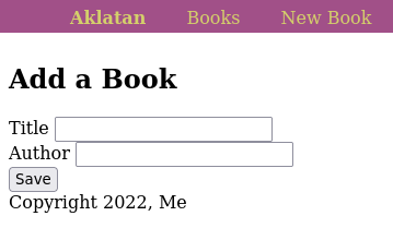
Screenshot of the New Book form before adding styling.
The main problems that I see with this:
- The input fields aren’t aligned.
- The input fields are mashed together – there should be some space between them, and also between them and the save button.
- The save button is too small and also needs some room between it and the page footer (really, the page footer should be pinned to the bottom of the page).
Again, let’s add some classes to our HTML so that we can target the right elements with our CSS. Modify templates/books/new.html to look like this:
{{ define "books/new.html" }}
{{ template "base/header.html" . }}
{{ template "base/errors.html" . }}

<h2>Add a Book</h2>

<form action="/books/new" method="POST">
  <div class="labeled-input">
    <label for="title">Title</label>
    <input type="text" name="title" id="title">
  </div>
  <div class="labeled-input">
    <label for="author">Author</label>
    <input type="text" name="author" id="author">
  </div>
  <button type="submit" class="submit-button">Save</button>
</form>

{{ template "base/footer.html" . }}
{{ end }}
Now we can add some CSS to fix the problems above in static/css/styles.css:
.labeled-input {
    margin-bottom: 1rem;
}
.labeled-input label,
.labeled-input input {
    display: inline-block;
}
.labeled-input label {
    width: 5rem;
}
.submit-button {
    margin-top: 0.5rem;
    padding-top: 0.75em;
    padding-bottom: 0.75em;
    width: 5rem;
    background-color: #70b45a;
    color: #111111;
    border-radius: 10px;
}
footer {
    position: fixed;
    bottom: 0;
    left: 0;
    right: 0;
    background-color: #a15088;
    width: 100%;
    height: 2rem;
}
footer div {
    margin: 0.5rem;
}
It’s worth reiterating the note above: this CSS is not great. If you try to use this across a much larger site you will find that it is very fragile. It’s also not responsive and probably a bunch of other problems I don’t even know about. It’s intentionally simple so that we can see what this looks like without adding more than 100 lines of code.
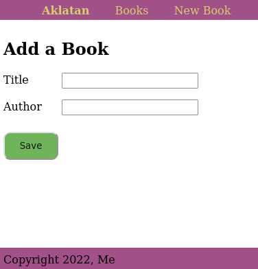
Screenshot of the New Book form after adding styling.
One More Thing!
While fixing up the form I realized there’s one more thing to improve: the error messages that get shown when the form doesn’t validate.
Add a wrapper div, and a class to the inner div in templates/base/errors.html:
{{ define "base/errors.html" }}
  {{ if .errors }}
    <div class="error-messages">
    {{ range .errors }}
      <div class="error-message">
        {{ . }}
      </div>
    {{  end  }}
    </div>
  {{ end }}
{{ end }}
And just a little bit more CSS:
.error-messages {
    margin-top: 1.5em;
    margin-bottom: 2em;
}
.error-message {
    font-weight: bolder;
    color: red;
    margin-bottom: 1em;
}
Now if you submit the form with blank inputs the error messages catch your eye a little better. Perhaps a bit jarring… but it gets the point across.
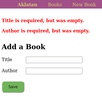
Screenshot of the New Book form with errors and styling.
Free Bonus: Go Embedding
What we’ve done so far is completely functional. We could stop here. But this is the bonus section, so of course we won’t stop.
When we deploy the app we have to remember to copy the templates and the style file, or the app won’t work. If you forget the templates you get a panic:
panic: html/template: pattern matches no files: `templates/**/*.html`

goroutine 1 [running]:
html/template.Must(...)
        /usr/lib/go-1.18/src/html/template/template.go:374
        github.com/gin-gonic/gin.(*Engine).LoadHTMLGlob(0xc0003c69c0,
        {0xab11f8, 0x13})
and if you forget to copy the styles then the app will run but because browsers won’t be able to load the CSS, it will go back to being barely readable.
And this is fine – you shouldn’t be deploying manually anyway, and the automated deployment process should always copy everything that’s needed. (We’ll talk about automated deployments in a future article.)
But let’s say that we want to be able to deploy the app by copying just one file. Go has support for embedding files into the binary, using the standard embed package (since 1.16).
First add three imports (code not shown): embed, io/fs, and path/filepath. Then add this code just after the imports:
//go:embed templates
var tmplEmbed embed.FS

//go:embed static
var staticEmbedFS embed.FS

type staticFS struct {
   fs fs.FS
}

func (sfs *staticFS) Open(name string) (fs.File, error) {
   return sfs.fs.Open(filepath.Join("static", name))
}

var staticEmbed = &staticFS{staticEmbedFS}
Note that the comments are specially formatted directives to the toolchain. This will embed, recursively, the files under the directories templates and static into the binary in those embed.FS variables.
The staticFS type there is to work around an annoyance. When we pass this to gin.Engine.StaticFS (see below), it’s going to get URL requests for the CSS file as /static/css/styles.css. Gin will strip off the /static on the front and try to get css/styles.css out of the embed.FS – but that file isn’t there, it’s under the static/ directory. So staticFS is just a thin wrapper around the embed.FS struct that prepends the static/ prefix back on to filenames so that the URLs map properly. (The fact that the explanation is about four times longer than the code is a testament to the simplicity of Go’s interfaces!)
With all of that set up, modify setupRouter to look like this:
func setupRouter(r *gin.Engine, db *gorm.DB) {
   tmpl := template.Must(template.ParseFS(tmplEmbed, "templates/*/*.html"))
   r.SetHTMLTemplate(tmpl)

   r.Use(connectDatabase(db))
   r.StaticFS("/static", http.FS(staticEmbed))
   r.GET("/books/", bookIndexGet)
   r.GET("/books/new", bookNewGet)
   r.POST("/books/new", bookNewPost)
   r.GET("/", func(c *gin.Context) {
           c.Redirect(http.StatusMovedPermanently, "/books/")
   })
}
Gin doesn’t have direct support for loading templates from embed.FS, but we can make a simple change to setupRouter so that this works. The template package provides ParseFS which can use our tmplEmbed, and then we can pass the resulting teplate to SetHTMLTemplate.
After rebuilding this, we can run the app from anywhere, as long as the database file is in the current working directory. (We’ll fix that in a future article.)
It’s worth pointing out that it’s somewhat more convenient to develop without embedding this way, because without embedding, as you make changes to the CSS or templates you can just reload the browser and see the results. But when everything is built-in, you have to rebuild every time you make a CSS tweak in order to be able to see the results in the browser. We could modify this behavior base on an environment variable, but I’m leaving that as an exercise for the reader…
Next Week
Next Tuesday’s post is about applying processes to improve the accessibilty of web apps. And on Friday we’ll work on adding a backend command to import data from a Goodreads CSV export file into Aklatan’s database.
Looking further out in terms of app features and future topics, I’ll cover pagination, adding notes to books (one-to-many relationships), and adding tags (many-to-many relationships); plus fuzzing, migrations, and more.